Thursday, May 15, 2014

Flows and Eddies

Here are a few photos of Flows and Eddies, the public art scattered around the Smith & Bybee Wetlands. Flows and Eddies is the name for the overall project, which is divided into a few sub-groupings, each of which in turn consists of a few individual sculptures. Two of these groupings are represented in these photos:

Ecology Stones

Forms found in the natural habitat of the lakes are carved in monumental scale basalt boulders, creating a “teaching landscape” that awakens viewers to the rich plant and animal life that surrounds them.

Mussel Shell

A large carved stone based on the fresh water mussels found in the lakes marks the entrance to the canoe launch. The lines of a mussel’s shell mark the years of its life. A second mussel shell paving stone is etched with the dates and cycles of time of important events in the history, prehistory and natural history of the lakes, making note of the ‘deep time’ found in wild places.

Not pictured are Habitat Reefs, Habitat Trees and Seasonal Encampment, mostly because I have no idea where they are. Smith & Bybee Wetlands is a huge place, and the art seems to be scattered a bit randomly all over the park.

Flows and Eddies is a fairly recent addition to the park, only arriving in 2004. Like Drawing on the River beneath the St. Johns Bridge in Cathedral Park, it was actually funded with One Percent for Art money from the still-unopened Wapato Jail. The jail borders a remote corner of Bybee Lake near the old St. Johns Landfill, and as you might imagine it doesn't welcome casual visitors. The then-sheriff figured it was silly to spend the public art money at the jail where nobody would ever see it, so a few outside projects were funded instead, including this one.

If you like these, you might also check out Urban Hydrology on the transit mall at Portland State University. Like Flows and Eddies it's a collection of nature-inspired Fernanda D'Agostino sculptures, but they're based on electron microscope images of diatoms. It's possibly my favorite of the new crop of transit mall art that arrived with the MAX Green Line. For whatever that's worth. If Google results are any indication, I may be the only person on Earth who pays attention to this stuff.

Courthouse Square, Edgefield SC


[View Larger Map]

Here are some old photos from the Courthouse Square in Edgefield, South Carolina. These photos are from the late 90s and show the town as a sleepy little rural county seat. It was a short day trip from Augusta, and the town was undeniably cute, but there just wasn't a lot to do once you were there. Google Street View indicates it's become a lot more twee since then. When your town square looks like a movie set, this sort of thing is bound to happen sooner or later, especially when you're a reasonable day trip distance from Atlanta. Moreover, given the rate of urban growth in Atlanta, Edgefield will probably be absorbed as a distant eastern suburb within a decade or so. I'm only half joking when I say that.

Anyway, yes, that obelisk in the center of the square is a Confederate war memorial. And yes, that's a statue of local son Senator J. Strom Thurmond next to it. Apparently -- and I was unaware of this until now -- there's a tiny etching of a cockroach, er, "Palmetto bug" hidden under Thurmond's right coattail. There is probably no polite way of looking for it, however.

Thurmond and his staff excelled at bringing home the pork to South Carolina, and Edgefield County in particular. The locals showed their gratitude by naming things after him, and since he was in office an uncommonly long time, they started to pile up after a while: Parks, roads, dams, schools, everything. You can't throw a rock without hitting something named for him, but then an outraged local will shoot you, so doing this is not advised. Thurmond even has half a lake named after him. There's a large reservoir on the Savannah upriver of Augusta that Georgia knows as Clarks Hill Lake. That's the name it was built under, but South Carolina later renamed their portion of it to be Lake Thurmond, and the dam as J. Strom Thurmond Dam. Georgia, not sharing South Carolina's enthusiasm for the man, declined to follow suit. You can always tell which side of the river someone's from by what name they call the lake.

Ala Wai Park & Canal


[View Larger Map]

Today's tropical adventure takes us to Honolulu's Ala Wai Canal and the adjacent city park & golf course. The canal surrounds Waikiki on three sides, separating it from the rest of the city. Until the 1920s, Waikiki was a low, swampy area. The canal was built for drainage, and was originally supposed to cut all the way through and make Waikiki an island. This had the lucrative and not entirely accidental side effect of making Waikiki prime real estate.

Unfortunately the canal's become famous for poor water quality and environmental problems; it's even been dubbed "Hawaii's Biggest Mistake" in some quarters. In 2006, major flooding caused a sewer line failure, resulting in millions of gallons of raw sewage being dumped into the canal. Several days later, a man fell into the canal, developed a massive bacterial infection, and died. So yeah, not so great. An ugly black emergency pipe installed after the floods was only just removed last May after a permanent replacement for the failed sewer line came online.

Despite all that, the canal is a popular rowing venue. I suppose because Hawaii doesn't have a lot of calm inland bodies of water, so it's either row here or row in the ocean.

The park is nice. When I visited it was full of joggers, kids at baseball practice, rowing clubs, people just enjoying the afternoon, and very few tourists. I don't think tourists cross the canal very often, and the park seems to cater to locals almost exclusively. It even has a huge community garden, for high rise dwellers who don't have room for their own gardens. The Diamond Head side of the park is a municipal golf course, unfortunately. Or fortunately, if you insist on playing golf for some reason.

Thursday, May 08, 2014

Pics: St. Augustine, FL

Here's another slideshow from St. Augustine, Florida. You've already seen Castillo de San Marcos and the Flagler College campus; this slideshow is everything else, or at least everything else I have photos of. The historic City Hall, various old churches, and a few city streets in the touristy Old Town area. Sadly I had to drive back to Cocoa Beach that afternoon and couldn't explore the city's frozen daiquiri bars or go on a cheesy "ghost hunting tour" or anything. So I'm pretty sure I didn't get the full St. Augustine experience, for good or ill. I suppose I could go back again, although at this point I've finally seen the old fort, and Vegas is a lot closer if I just want a giant daiquiri.

Flagler College, St. Augustine, Florida


View Larger Map

When I was in Florida back in 2011 for a Mars rover launch, I made a side trip up to the town of St. Augustine to visit Castillo de San Marcos, a centuries-old Spanish fort I'd tried and failed to visit on two previous occasions. Since I was there anyway, I wandered around the historic (if heavily touristed) downtown for a bit, taking photos of anything that looked old. One of the highlights of the area is Flagler College a small private liberal arts college built around the former Ponce de Leon Hotel. The ornate hotel building is nowhere near as old as the Spanish fort; it was built in 1888 by railroad oligarch Henry Flagler, in a sort of Spanish-Moorish fantasia style. I didn't go inside to look around, but apparently the interior is a bit over the top as well. The building's actually a concrete structure, with electricity designed in from the beginning. Which is a bit more forward-thinking than you'd expect for the year 1888. As you might imagine it's on the National Register of Historic Places, a fake-historic building that's become historic in its own right with the slow passage of time.

Wednesday, April 30, 2014

Composition

The next object outside the Portland Art Museum is Michihiro Kosuge's Composition. The museum's page about it gives the date as 1960-1974; I'm not sure what the 14 year time span means: Designed in 1960 and fabricated in 1974? Slowly constructed in fits and starts over a decade and a half? The page does't explain. Kosuge also created Continuation for the circa-2009 MAX Green Line project, created from recycled bits of an old fountain from the original transit mall. Given how much time elapsed between the two, I suppose it's no surprise that they don't closely resemble each other.

Composition was in the personal collection of sculptor Tom Hardy (best known for various animal sculptures, & the series of Oregon Landscape panels at PSU). He donated it to the art museum in 1982.

I've mentioned before that I walked in to the museum's outdoor sculpture court and was able to guess the artist for a surprising number of the pieces. This wasn't one of them. I saw the Cor-Ten steel and the size and immediately assumed it was a Lee Kelly, a companion to his Arlie on the other side of the plaza. I was thinking it was one of his better efforts, somehow more elegant and mathematical than the others, and then I realized it wasn't his at all. So yeah, I do kind of like it, aside from my usual grumbling about Cor-Ten as a medium. Portland Public Art didn't like it, although that's sort of par for the course at that erstwhile blog. Kosuge was recently profiled in a February 2013 Oregon Art Beat segment, in connection with a PICA show last spring featuring his work.

Gulf Stream

The next item from outside the Art Museum is Gulf Stream by the British sculptor Anthony Caro. Apparently he also co-designed the Millennium Bridge in London, among other things. I admit to being unfamiliar with his work, but as I've never claimed to be an art critic or any other sort of art expert, I wouldn't consider that an interesting or valuable data point. An NYT article from 2007 called out Gulf Stream as a highlight of the museum's outdoor sculpture plaza, along with Roy Lichtenstein's Brushstrokes, though it's possible these two were named just because readers in New York were unlikely to have heard of most of the Pacific Northwest artists represented here.

I'm fairly certain that the canopy over the top is not part of the art, and it's just there to protect Gulf Stream from the elements. You could potentially read this as some sort of artistic commentary about whether Serious International Art is suitable to this part of the world. I doubt that was intentional though; sometimes a canopy is just a canopy. Still, I think it's legitimately "found art". I'm fairly certain a real art museum in a real city would understand this, and let me go and sign my name to the combo and sell it back to them for an astonishingly large sum. Here, though, they'd probably just taser me or something.

Winter Column

Today's object from outside the art museum is Winter Column, by Hilda Morris, who also created Ring of Time, the "Guardian of Forever"-like ring outside one of the Standard Insurance buildings.

I realize it's abstract midcentury art, and speculating about what it's supposed to "look like" is the mark of an uncultured barbarian. But it does look a lot like an inverted tree root, torn out of the ground, like something you'd see in a clear cut, or floating down the Willamette after a winter storm. Ring of Time has the same rough organic look to it; it's easy to forget these are metal objects. Morris wasn't the only midcentury Portland artist to do this, and I've said once or twice that Frederic Littman's look just isn't my cup of tea. Somehow Morris's rough organic look works, where Littman's doesn't, at least to my barbarian eyes.

Monday, April 28, 2014

Mars Rover Models, Kennedy Space Center

When I was in Florida back in 2011 for the launch of the Mars rover Curiosity, the Kennedy Space Center visitor center had a display showing three generations of Mars rovers. From largest to smallest, they are: Mars Science Laboratory/Curiosity (2011); Mars Exploration Rovers/Spirit & Opportunity (2003), and Mars Pathfinder/Sojourner (1997). Both Curiosity and Opportunity are currently operating, the latter now a few months into its tenth Earth year on Mars.

In addition to these rovers, and garnering much less publicity, there has also been a series of Mars orbiters over the same time period. In fact, beginning July 4th, 1997 there has always been at least one operating spacecraft at Mars, either on the surface or in orbit. In fall 2015, the annual Beloit College Mindset List can say that within the lifetimes of incoming college freshmen, there have always been robots at Mars. That's pretty amazing, if you ask me.

Sunday, April 27, 2014

Fishbird Bridge

Here's a slideshow about NE Portland's Fishbird Bridge which crosses the northbound lanes of I-205 at the Parkrose-Sumner MAX station. The bridge doubles as the big public art piece for this MAX station, so this post is -- unusually -- both a bridge and an art post. TriMet's Red Line art guide describes the bridge thusly:

The "Fishbird" bridge, designed by Ed Carpenter, provides pedestrians access to this station platform located in the median of I-205. Being near the Columbia River and the Portland International Airport, the bridge is meant to suggest a creature which might swim or fly. Passengers on Airport MAX as well as motorists on I-205 are treated to dramatic views of the huge, enigmatic creature flying over the freeway.

Some tidbits about the bridge, from across the interwebs:

  • DJC profile of Carpenter from October 2001, shortly after the bridge (and the Red Line) opened
  • A portfolio page by the firm that did the custom wire fabrication for the bridge.
  • A blog about transit & urban planning reviewed the Parkrose/Sumner Transit Center and vicinity and found it wanting. The proposed solutions, as usual, involve adding density and pedestrian goodies and so forth. Which sounds nice and Portlandy; retrofitting dense urbanism to what's essentially a midcentury car-commuter suburb is easier said than done, though. Anyway, I increasingly worry that the word "density" is just code for gentrification, disguised as a value-neutral technical issue. I suppose the project numbers don't pencil out unless the buyers are rich Californians or something.
  • In 2001, Parkrose High School students in an after-school engineering program built a model of it, learning about math, engineering, and construction techniques in the process.
  • An August 2000 Oregonian article about the bridge's installation. It was built off site and trucked in for installation, not constructed on the spot. The paper's architecture critic spends most of the article explaining that we aren't spending enough on premium art, architecture, and design. It's not a goal I necessarily disagree with, per se, but there's something off-putting about how it's argued. It feels too much like a marketing pitch, I suppose, playing on the audience's insecurities: We need "signature" design to prove we're a Real City, much the same way that middle aged men need Porsches to prove that 48 and balding is the new sexy. I kind of ranted about the Oregonian guy a few years ago in a post about Collins Circle, a place he absolutely loved and I didn't. Maybe I've mellowed out a bit since 2007, or maybe I just can't get that worked up over a news story from 2000. Either way, I'm just going to say the guy did a great job advocating for the people he covered on his beat, but perhaps lacked a broader perspective on the needs of the city as a whole. That feels reasonably civil and polite. I think I'll leave it there.

Brushstrokes

Today's installment in the ongoing "art outside the Portland Museum" series is the largest and probably newest of the lot. Brushstrokes is the enormous, brightly colored Roy Lichtenstein sculpture outside the museum's north building (the old Masonic temple). It's right on the Park Blocks in front of the building, it's painted in bright primary colors, and it's about 30 feet tall. You can't miss it.

Brushstrokes is part of a larger series of paintings and sculptures made beginning in the mid-1960s. Portland's Brushstrokes was created in 1996, making it one of Lichtenstein's last works. The series began with paintings in LIchtenstein's unique style, like the ones at the Tate in London, and at MoMA in NYC. The sculptures came later, starting in the 1980s, and were inspired by the earlier paintings. An art museum in the Hamptons has a pair of Tokyo Brushstrokes sculptures on display. The Getty has Three Brushstrokes, and the New Orleans Museum of Art recently acquired a Five Brushstrokes. Brown University appears to have another copy of the same Brushstrokes that Portland has. There was even a Brushstrokes chair and ottoman, circa 1986-88. The New Orleans story has a good explanation of what motivated the Brushstrokes series:

Roy Lichtenstein, who was born in 1923, made his mark on art history in the rock 'n' roll era. At the time, highly emotional paintings by abstractionists such as Jackson Pollock and Willem de Kooning were the rage. Lichtenstein’s approach couldn’t have been more different. He imitated the lowbrow illustrations in comic books with a meticulous, passionless painting style. The impersonal, melodramatic comic book cells that he reproduced seemed to mock the earnest emotionalism of the self-involved abstract painters that came before him.

To put an even finer point on his dryly humorous commentary, Lichtenstein created deadpan close-up paintings of drippy action-packed brush strokes – just the sort of fevered brush strokes that Pollock and De Koonig had made famous. Lichtenstein re-imagined some of those satirical brush strokes in three dimensions – “Five Brushstrokes” is an example.

Saturday, April 26, 2014

Nickel Plate Road High Level Bridge


[View Larger Map]

If you happened to be reading this humble blog late last year (and you haven't quite gotten bored of it yet), you might remember me posting a flurry of Cleveland bridge photos. I was there for a weekend back in March 2012, and the posts have sort of been trickling out since then. Count your lucky stars I'm not in the breaking news business.

Anyway, I still have a couple of Cuyahoga River bridges left, believe it or not. Today's installment is yet another railroad bridge, this one for the Norfolk Southern line next to the Innerbelt Bridge (and/or its under-construction replacement). This post took a while took a while to put together because I had trouble figuring out what the bridge is called. You can't get far in this blog business unless you can at least name the thing you're writing about. I do know a few people in Cleveland, and I suppose I could have just asked them, but it feels like kind of a weird and esoteric question, and they'd probably ask me why I'm not writing about the Rock & Roll Hall of Fame like a normal person, and I wouldn't have a good answer for them, and it would be embarrassing. Anyway, I tend to just trust in my Google-fu to eventually come up with the right search terms sooner or later, which is what happened this time.

So according to certain parts of the internet, this is the Nickel Plate Road High Level Bridge. To clarify the name a little, "Nickel Plate Road" was the original railroad that built it, and not the name of a city street, and "High Level" meaning the railroad runs on an elevated trestle above the Flats, unlike many of the other railroad bridges in the area, which are "low level".

As for the strange name of the railroad, I initially assumed -- given the industrial location of the bridge, the piles of gravel, the cargo ships, etcetera -- that the rail line must have served either a local nickel plating plant, or a Superfund site that used to be a nickel plating plant. But that's not the story at all. A railroad page at Cleveland Memory explains that back in the 1880s when the railroad was built, "nickel plated" meant shiny and fancy, and the railroad was intended to be a first class operation, no expenses spared or corners cut. The whole idea with making this a high-level bridge was to give the rail line a level route through the city, without slow uphill and downhill sections. The first bridge at this spot was a swing span bridge that opened in August 1882, as the final link in a line connecting New York and Chicago. That bridge was replaced with the current lift span bridge in 1917, to accommodate larger and heavier trains. In 1957, the lift section was replaced with one with a higher clearance, to allow larger ships to sail upriver from here.

So that's what I know about the bridge. It occurs to me that this is the umpteenth-plus-one railroad bridge I've posted about that's painted a flat black color. And I don't know why. Why black, of all colors? Not because it's chic or slimming, I imagine. Is black paint slightly cheaper? I have no idea. If you know, or have an interesting theory, feel free to leave a comment in the little box below. Thx. Mgmt.

Thursday, April 24, 2014

Cloud Cavu

Today's adventure takes us to the Mt. Hood Avenue MAX station, the last Red Line station before the airport. It's part of the Cascade Station retail area, and it looks like your basic suburban MAX station, with a full set of recent-vintage big box stores, and the traditional something-on-a-post sculpture, which we'll get to in just a moment.

Today's Cascade Station is not really what the city hoped would happen here. Other than the jets overhead, it looks exactly like a retail center in Tualatin or Vancouver or (shudder) Seattle. But it's not like swanky condo towers were feasible (or even legal) this close to the airport, and condo towers are normally Portland's one-size-fits-all prescription for everything everywhere. The city didn't have a creative plan B for the land, so national big boxes and chain restaurants filled the void.

An additional factor driving this is Oregon's lack of a state sales tax, which pulls Washington shoppers across the Glenn Jackson Bridge in search of deals. For whatever reason, Washingtonians seem to be mad for big national chains, so the Oregon sides of both the Glenn Jackson and Interstate bridges have turned into outposts of retail suburbia within Portland city limits. The only local businesses in the area seem to be video poker cafes, another inexplicable thing Washingtonians can't seem to get enough of. On the flip side, Washington lets you walk into a grocery store and buy Sudafed, a jug of vodka, and a crate of fireworks, and you can legally pump your own gas while you're up there. Supposedly they'll even have legal cannabis stores in a few months, though the date keeps getting delayed. So, six of one, half a dozen of the other, I guess.

But I digress. We're here in pseudo-suburbia to visit Cloud Cavu, the art I breezed right past in the first paragraph. TriMet's Red Line art guide describes it:

Designed and fabricated by rhiza A+ D, "Cloud Cavu" was the result of a public and private partnership involving TriMet, the Portland Development Commission, Summit Group and the Port of Portland. "C.a.v.u." is an aviation term meaning ceiling and visibility unlimited. The sculpture was inspired by the experience of arriving and departing by plane through Portland's winter cloud-filled sky.

The something-on-a-post design I mentioned earlier is common along the Green and Yellow MAX lines; I think the reasoning is that the art's harder to vandalize this way. This is probably one of the better ones, as far as these things go; it picks a single theme and runs with it, instead of trying to embody the whole Wikipedia article about the surrounding neighborhood like many of them do. It probably helped that there was no surrounding neighborhood when the MAX station went in, but hey. It does remind me a little of the folding cardboard dividers that come in boxes of beer or wine bottles, not that there's anything wrong with that. Anyway, for more info, here's the design firm's page about Cloud Cavu, which has more photos of it, and the Port of Portland's press release about it when it went in.

Flying out on a grim winter day (the inspiration for Cloud Cavu) is an experience worthy of a sculpture or two. Imagine: It's cold, grey, dreary, probably raining outside. But it's suddenly not so bad, because you're leaving on a jet plane. The plane takes off, the raindrops covering your window are blown dry by the wind, and the ground quickly falls away. Winter clouds hug the ground tightly, so you reach the cloud deck in no time at all. You're in for a few minutes of dense fog and mild turbulence as the plane climbs through the clouds. And then, quite suddenly, you're through. The sun shines brightly in the deep blue sky, and a sea of misty cloud tops stretches to the horizon. You know everyone down below is getting rained on, and they're complaining they haven't seen the sun in months. That was you just this morning, in fact, but that now seems long ago and far away. You see a few contrails off to the side, other planes full of other people who are in on the secret. The plane turns, and there's the top of Mt. Hood, poking up through the clouds. (This doesn't always happen, but it can, so you might as well imagine it this way.). You stare out the window for a while, then someone comes by with a cart and brings you a coffee or a merlot mini-bottle. The whole thing is like magic, and it never gets old.
Wednesday, April 23, 2014

Benson Bridge

You might recall I've been doing a series lately about historic bridges along the Columbia River Highway. Today's installment takes us to by far the most photographed of them all. This, of course, is the Benson Bridge, the famous footbridge at Multnomah Falls, as seen in every Oregon calendar ever created, and every tourist guide to Portland ever written. The bridge carries a hiking trail that continues on to the top of the falls, although casual tourists often stop and turn around here.

The bridge was in the news back in January when it was damaged and temporarily closed by a falling boulder, and the bridge is still closed as I'm writing this. These photos were taken well before the big boulder crash, so you can see what it's supposed to look like, and hopefully will look like again soon.

The bridge was designed by Karl P. Billner, who also designed many of the road bridges along the old highway, including the ones at Shepperds Dell and Latourell Falls. So although the Benson Bridge obviously isn't part of the highway, it shares what today would be called a common design language: They share the basic concrete deck arch design, and even the railing style is the same as the other bridges. To my untrained eyes it looks like a scaled-down copy of the Shepperds Dell bridge, but its Historical American Engineering Record entry explains it has a variety of unique features, things that you probably have to be a practicing civil engineer to really appreciate.

I've always been curious whether the bridge was controversial when it first went in. Multnomah Falls was already a famous scenic landmark at the time, and adding a bridge significantly altered its appearance. If there wasn't already a bridge here in 2014, and someone proposed building one, it would be hugely controversial and I can almost guarantee you the plan wouldn't go through. I checked the Multnomah County Library's Oregonian database in case there were any nervous editorials or outraged letters to the editor. I haven't come across any, however, and I think I understand why not.

The key detail is that when the bridge was built, starting in August 1914, the land around the falls was still owned by Simon Benson, a local timber baron and philanthropist. He's probably best known for donating the Benson Bubbler drinking fountains located around downtown Portland, and he's appeared here before in connection with the Benson Tower, a recent condo tower on the original site of his downtown mansion, which was relocated to the PSU campus some years ago. Benson would soon donate the area to the City of Portland, but when the bridge was built, Multnomah Falls was still Benson's personal waterfall and legally he could pretty much do whatever he wanted with it. Since he happened to be in a philanthropic sort of mood, he paid for the bridge himself and somehow borrowed the state's highway engineers to design it.

The actual construction was subcontracted out to R.L. Ringer, who also built the Crown Point Viaduct up around the Vista House. Ringer apparently took a great deal of pride in his work here, and secretly left his name and the date in the wet concrete, with the idea that he probably ought to sign his masterpiece. His superiors later ordered him to cover it up, which he did... with clay that matched the surrounding concrete. So when he checked back a year or so later, the clay had worn off and the initials were exposed again. Subsequent restoration efforts (including a major restoration in 1987, and a smaller effort as recently as 2012) have been careful to preserve this inscription. I'm not sure where exactly it's located on the bridge; hopefully it survived the recent boulder incident.

The bridge's resemblance to the highway's bridges gave at least one person the wrong idea. There was a strange incident in 1932 in which someone drove a tiny Austin 7 automobile up the Multnomah Falls trail and photographed it parked on the bridge. I wouldn't believe it without photos, and even with them I'm still kind of incredulous. The way the car's facing suggests Mr. C.W. West of Portland managed to drive up to the bridge and across it, then turned around somewhere and did this photo shoot on the way back to the lodge. The caption's written as if this was just an amusing stunt someone pulled on a lark, and there's no mention of anyone being arrested over this, or even park rangers wringing their hands and telling the damn fool public to knock it off fer chrissakes.

Anyway, because I am a dork, I always get that one Enya song from Fellowship of the Ring stuck in my head when I see this bridge. You know the one:

Waterline

As with the previous post, we're once again at the Delta Park/Vanport MAX station to look at another piece of Yellow Line public art. This one takes a bit more effort to find; the station includes a couple of overflow parking lots, the furthest next to the entrance to Portland International Raceway. The whole area is naturally low and marshy, and they must have concluded the parking lot would need a stormwater drainage feature. So a small wetland area was created and the lot built around it. This being a publicly funded transit project, some 1% For Art money was spent on sprucing up the new wetland area, and Waterline was born:

The artist was involved with much of the site design including grading, lighting, materials, and plant design. The visual focus is a basalt boulder that Is cut in half with stacked welded steel and acrylic and is lit with fiber optics at night.

That "Art of Stormwater" list from the city that I keep referring back to has a different take. (I apologize for this post being so quotation-heavy, but I figure I can either give you the original descriptions by people who knew what they were talking about, or I can try to paraphrase them as best I can, and I'm not really in a paraphrasing mood.)


Linda Wysong, Artist; 2004 Located near the Vanport site, Waterline integrates art, engineering, and the environment - reflecting the juxtaposition of the built and the natural environment in the managed landscape.

TriMet's Yellow Line art guide elaborates further:

  • Massive steel arcs allude to the engineered landscape and Liberty ships made by Vanport residents.
  • A glowing monolith of stone, steel and acrylic symbolizes the unity of human and natural worlds.

The "glowing monolith" resembles parts of Wysong's Shifting Assets along the Willamette stretch of Springwater Corridor. You can't really see the "glowing" part here since I took these during the day, but another of the city's stormwater art documents (since stormwater art is a thing apparently) has a nighttime photo of Waterline, showing the, uh, water line glowing. This saves me the trouble of going back to take my own nighttime photos. Which I probably wouldn't do anyway, on the theory that there are likely to be a few mosquitoes here at night for much of they year. I've gone on several times about (pseudo-)bravely risking a case of West Nile on behalf of this humble blog and its Gentle Reader(s). In reality, I think I'd like to avoid that, if at all possible.

Vanport

North Portland's Delta Park / Vanport MAX station features a number of steel tent-like shapes next to the platform stairs. These are collectively known as Vanport, and they're one of the public art installations at this stop:

This storm water swale treats water collected from the bridge and parking lot. The three Corten roof sculptures refer to the Vanport flood,

Michael Creger for bronze storm drain scupper on wall.
It's fair to say this is one of the more downbeat public artworks around town, focusing as it does on the deadly 1948 Vanport Flood. TriMet's Yellow Line art guide elaborates further:
Linda Wysong addresses the area's layered history with an emphasis on the city of Vanport, a large wartime housing project swept away by the flood of 1948.
  • CorTen steel sculptures recall rooftops adrift in the 1948 floodwaters.
  • Remnants from a Vanport foundation are set into the sidewalk.
  • A bronze railing features cast artifacts from the Chinookan culture, Vanport and the Portland International Raceway.
  • A cast-bronze scupper channels stormwater into the bioswale below.
  • Community maps overlay the current Delta Park site onto the city grid of Vanport, and show the location of the station within the local river systems.
  • Works by Douglas Lynch and Timothy Scott Dalbow are reproduced in porcelain enamel on steel.

Wysong also created a number of other things we've seen here before: Shifting Assets along the Springwater Corridor; and Portals and Eye River, near the east end of the Hawthorne Bridge, north of OMSI. Several of those pieces have water themes as well. She also created Waterline elsewhere at the Vanport MAX station, which will be the s

I should point out that the Yellow Line opened in 2004, a year before Hurricane Katrina. That, and not the Vanport flood, is probably the event that comes to mind now when you think of floodwaters and rooftops. If, by chance, the line had been delayed, or the hurricane had come a year earlier, this sculpture might have been considered sort of, I dunno, insensitive.

Monday, April 21, 2014

Sellwood Riverfront Park


[View Larger Map]

Today's adventure takes us down to Sellwood Riverfront Park, just north of the Sellwood Bridge, in -- unsurprisingly -- the Sellwood neighborhood of SE Portland. These photos were taken a few years ago, and I think this area's all torn up with Sellwood Bridge construction right now. I'd gone there to take photos of the (soon-to-be-replaced) current bridge, and managed to also take a few decent ones of the surrounding area. So I figured I could get a post about the park out of the deal. Unfortunately I had a bit of a lens dust issue that day, and many of the photos included an obvious hair or piece of lint. So I dropped some photos in a folder and procrastinated about them, because trying to repair dust errors in photos is really annoying and tedious. After mumble-mumble years of ignoring them, and also not going back for dust-free photos, I decided to just go ahead and post them, apologize for the ugly specks, and try to make up for it with scintillating historical research and a sea of fascinating facts.

That strategy would work better if I had more history to work with. But I don't. The park is surprisingly recent in origin, and I've only got a handful of items to share, none of them particularly earthshattering:

  • The city recorded the park as "Undeveloped" in 1983, and applied for a $150k National Park Service grant to help develop it. The Wikipedia article for the park says this was previously a mill site before becoming a park, but that statement isn't sourced and I'm having trouble chasing down info about this previous incarnation.
  • The park was dedicated July 1986, as the very first public river access for SE Portland. (There's river access at Oaks Park too, but it may have still been a private for-profit concern at the time.)
  • Failed renaming attempt in September '86, would have been named for a (then-)living man. Would have become "Dent Thomas Neighborhood Park" if the proposal had gone through. Neighborhood activist, advocated by local neighborhood association. Would have also renamed Alberta Park as "Mumford Park" after a recently deceased local minister, and Irving Park would have become "Stevenson Park" after a recently deceased security guard. Reactions were mixed to the idea.

Molecule

It's taken me a while, but here's the third part of the Constellation trio in Holladay Park, along with A Neighborhood Gardener and Vase of Flowers. RACC calls it Constellation (Molecule):

This project attempts to illustrate the connection between the personal front yard garden and the civic park/garden. This is explored through three distinct elements. A vase of cut flowers, an abstract molecule containing elements of a good neighborhood, and the figure of a gardener/homeowner, shears in hand. The objects in the molecule were selected by the Sullivan Gulch Neighborhood Association and the person who was cast was Carolyn Marks Backs - A longtime neighborhood activist - Also selected by the Neighborhood Association.

The Smithsonian arts database calls it "Constellation: Isolated Molecule for a Good Neighborhood" (Which is way too precious to use in a blog title here). Their description:

An enlarged structure of a molecule featuring atoms in the shape of a garden tool, a milk carton, a coffee mug, a bagel, a house, a school, a family, and trees --all the things that make a good neighborhood.

...or at least that make a good cozy Portland white bourgeois lifestyle, circa 1999. Most parts of the country would have included a church too, and fought all the way to the Supreme Court to keep it; here it probably didn't even occur to anyone.

If we had to revamp the molecule in 2014, it would obviously include bikes and a more diverse notion of family. Someone would probably complain about all the dairy and gluten imagery, and they'd be replaced with kale or quinoa or something. Volunteers would come forward and install a working WiFi router inside, insisting that's just as essential as the other stuff.

Saturday, April 19, 2014

Thomas Square, Honolulu

While I was wandering around Honolulu a few months ago, I happened to walk past Thomas Square, a city park with a circle of enormous intertwined banyan trees, or possibly it's all one banyan tree. That seemed kind of remarkable so I snapped a few quick photos before continuing on my way. Going by other photos I've seen of the park, apparently there's also a large fountain somewhere in there, hiding under the trees, but I didn't even notice it at the time.

At a street corner on one side of the park, a couple of guys were running a table offering left-wing and (De)Occupy Honolulu literature. It seems the park had hosted an Occupy encampment during the movement's heyday, similar to the one in Portland's downtown Plaza Blocks, and their choice of this particular park was anything but random.

Throughout the 19th Century, the US and various European powers jostled and schemed over control of the Hawaiian Islands, while the kingdom tried to fend them all off and remain independent. In 1843, the commander of a British naval vessel announced he was annexing the islands for the Crown due to various perceived slights against British subjects, and he declared a provisional government with himself in charge. King Kamehameha III filed a formal protest with the captain's boss, Admiral Richard Darton Thomas, at the British Navy's Pacific Station in far-away Valparaiso, Chile. Several months later, another British vessel arrived, with Thomas aboard. Thomas, of course, outranked the first vessel's captain and thus control of the new "colony" passed to him. Thomas, in turn, quickly handed power back over to Kamehameha III, in a ceremony at this spot. This is not at all how colonial empires of the 19th century usually operated, and I've yet to see a good explanation of why the islands were handed back, when so many other places around the globe weren't.

Shortly after the handover, the king proclaimed the area a public park and named it in honor of Admiral Thomas. Over subsequent decades the park design evolved into today's square.

For what it's worth, Thomas also has a swanky condo tower named in his honor, a few blocks away.

Piedra Negra

Today's object from outside the Portland Art Museum is Piedra Negra by Manuel Neri. Neri also created Ventana al Pacifico at the Gus Solomon Courthouse, to which Piedra Negra bears a certain resemblance. A passage from Neri's Wikipedia bio seems applicable here:

He is noted for his life-size sculptures, which though clearly figurative in nature, are abstracted figures rather than realist representations. His sculptures primarily focus on the gesture, and the surfaces of his sculptures are often, sanded, chipped, or painted to emphasize textures.

Piedra Negra previously exhibited in The Essential Gesture a 1994 show at the Newport Harbor Art Museum in Newport Beach, CA. The show was curated by Bruce Guenther, who in 2000 went on to become Chief Curator at the Portland Art Museum. Piedra Negra followed him in 2002 when it was donated for the museum's 110th birthday. Because arranging that sort of thing is what curators do.

Feathers

At Portland's Gateway Transit Center, three giant blue feathers twist in the wind atop 20' poles. Feathers was added as part of the MAX Red Line project, and TriMet's Red Line art guide has this to say about it:

The Gateway "Feathers" by Frank Boyden consist of three 14-18' long painted aluminum feathers that track the wind atop 20' poles. The feathers, which are visible from the I-205 freeway, the bike path and the train, create a landmark for the transit center and signify the start of the airport line with a bright and colorful allusion to flight.

Boyden also co-created the Interactivators along the WES line.

The main problem with Feathers is that it only makes sense if you realize it arrived with the aviation-themed Red Line, and you'll only know that if you Google it. Gateway is really busy most of the day and the feathers are in a fenced-off area, and (typically for TriMet) there doesn't seem to be a sign for it. So it's just going to be a mystery for almost everyone who notices it. Although I often wonder whether anyone other than me bothers noticing this stuff. (I just might be, if Google results are any indication.) Still, transit art is something to look when if your bus is late, I guess, or when the train's out of order again.

Friday, April 18, 2014

Kenton Park


[View Larger Map]

Photo of N. Portland's Kenton Park, a few blocks west of the Kenton MAX station. This was sort of an afterthought when I went to take photos of the (locally) famous Paul Bunyan statue; it's the usual neighborhood park, big grassy area with sports fields. I imagine many fond childhood memories have been created here, but Google hasn't figured out how to index those yet, which I'm sure is for the best.

I figured I'd check the Oregonian database for interesting items, in case there was anything to make up for the park's lack of visual uniqueness. Nothing earthshaking here either, but I did put together a short list of miscellaneous news items:

  • The North Portland Commercial Club Women's Auxillary decided to work in favor of a park in 1913. The story reports that they usually focused on rose shows and "eugenic contests" whatever those were. I'm fairly sure I would be horrified if I knew what those were.
  • It was only designated an official city park in 1954; the article notes unofficial names had been in use for quite some time.
  • The Oregon Centennial Wagon Train made a stop here in 1959. The trip began far away in Independence, MO, retraced the Oregon Trail west from there, and ended at the Expo Center, home of the centennial exposition. The leg from Independence OR to Kenton was made with the wagons on the backs of trucks, but at Kenton Park they saddled back up and made the final leg of the journey the traditional way. The story notes that of the 26 people who set out on the journey, only 19 stuck with it to the end. It doesn't explain what happened to the others, so I'm just going to assume they died of dysentery, like in the game.
  • In July 1977, the park was home to an honest-to-goodness organized Hacky Sack tournament. Feel free to roll your eyes at the 70s if you want. I know I am.
  • As I've noted in previous posts about the Kenton area, the 1980s were not a kind decade to the neighborhood. The real estate ads tail off, replaced with stories about petty crime and transients. A December 1985 story chronicled local anxiety about an influx of strip clubs to the neighborhood, with one person saying it wasn't safe for kids to go to the park anymore.
  • A January 2008 story about gentrification mentions the park in passing; the neighborhood had been trying to attract a new Multnomah County Library branch, and a couple of proposals would have sited new library buildings near the park, in a mixed use development with condos on top, similar to libraries in the Sellwood and Hollywood neighborhoods. Then the global economy crashed later that year, and the condo market with it. Kenton ultimately did get a new library, but it opened in an existing storefront on Denver Avenue instead.

Engine

Portland's Fire Station #1, at Naito & Ash, is a cool midcentury building dating back to 1951. At one point during the late-2000s real estate bubble, the city decided the building was obsolete and seismically unsafe, and the only solution was to tear it out, move the fire station away from the Skidmore Fountain area, and put in a super-upscale condo tower in its place. I suppose because being protected from fires and so forth isn't upscale enough. Saturday Market was booted from under the Burnside Bridge to make room for the UO Architecture School, but replacing the fire station fell through and they reluctantly made seismic upgrades on the existing building instead. As with all public buildings, 1% of the construction costs went to public art, which in this case was a stained glass window to brighten up the main entrance to the fire station. This is Engine:

Engine by Jack Archibald is inspired in part by the poem ‘The Great Figure’ by William Carlos Williams, and by two paintings also based on the poem by Charles Demuth and Robert Indiana. Archibald approached this piece wanting to create a totemic image for the headquarters. “Color, flash, and kinetics all held fast in the confines of the station’s entryway. The glasswork is intended to evoke explosive movement held in check, heroic energies at the ready, dramatic moments about to unfold... My intent was to modernize the imagery in the medium of glass, which is, I think, a kind of frozen energy itself, ready to explode when light hits it.”

The page continues with the aforementioned poem, which I'm leaving out just to be on the safe side, copyright-wise. Instead, here's a page at Emory University with the poem and the Demuth painting it inspired; and one at UIUC with three critics discussing it. The TL;DR here is that the window has a properly serious and highbrow inspiration, and one that relates directly to fire engines, which is no small feat. (And it's more eye-catching than the older piece with the stylized fire ladders out back of the fire station.)

On the other hand, the users of PoemHunter.com (which exists) only give it a 5.5 out of 10, and everyone knows it's the 21st Century and crowdsourced wisdom is superior to the stodgy old-fashioned kind. Although they currently have a Kipling in their top 10, which is just silly. Still, we defy the mob at our peril, and the next time someone wants stained glass inspired by a poem, we should probably stick to the one about the guy from Nantucket.

Wednesday, April 16, 2014

Forest, McDowell Creek


[View Larger Map]

Here's a slideshow from Linn County's McDowell Creek Falls County Park, near Sweet Home, OR. The park's waterfalls have appeared here already:

I'm not sure if this area is technically part of the Cascades or not, but the moss-covered trees tell us the park gets a lot of precipitation. It's not quite as rainforesty as the Olympic Peninsula, say, but it still makes for some interesting photos. Or at least I thought they were interesting.

Tuesday, April 15, 2014

Beverly Cleary Fountain & Sculpture Garden

In NE Portland's Grant Park, there's a small plaza with trio of statues of characters from Beverly Cleary's Ramona books, which were set in the surrounding neighborhood. In the summer months there's also a small fountain here, I guess for kids to play in; it wasn't running when I stopped by, but someone posted a YouTube video of it taken last summer. The whole assemblage was created by Lee Hunt, who also created the Human Comedy terra-cotta faces on a building at 3rd & Yamhill downtown.

I admit I never read any of the Ramona books as a kid, and it's a bit late to do so now, but I understand they're a fond childhood memory for a lot of people. So I can't speak to what scene from which book this is, or whether the characters look the way the books describe them.

The problem here (which is one I've discussed before) is that statues of kids are always creepy. Or at least they always look creepy in photos. I think it might be the facial expressions; Statues of presidents, generals, prominent local businessmen, etc., can pose their subjects gazing nobly into the middle distance, boldly leading us into the future or something. With kids you can't really do that, so they're often pictured laughing and smiling, and that doesn't translate into bronze as well. Whatever the cause, statues of kids always seem to evoke the "uncanny valley" effect, the same reason creepy clowns and ventriloquist dummies are so unsettling. I swear they didn't look this creepy in person, maybe because you can see they're child-sized and nonthreatening and not at all Chucky-like. Or at least not Chucky-like during daytime. At night it's anyone's guess.

Sapporo Friendship Bell

Here are a few photos of the Sapporo Friendship Bell in front of the Oregon Convention Center. The bell marks the longstanding sister city relationship between Portland and Sapporo (the big city on Japan's northern island of Hokkaido, host city for the 1972 Winter Olympics, and namesake of a beer you may have heard of). There's a second bell that marks the sister city relationship between Portland and Ulsan, South Korea. I didn't realize the two bells had different origins at the time, so right now I only have photos of the Sapporo bell and I guess I'll need to go back for the other one at some point. Although I may hold off on that until my Drafts folder is a bit smaller.

The two bells were the focus of a brief controversy in 1990, when a local evangelical Christian group objected on First Amendment grounds, claiming the bells were a Buddhist religious symbol and should either be removed, or joined by a nativity scene. Convention center management didn't buy the argument; the bells stayed, and there's still no nativity scene. The ACLU was reported to be "looking at the case" but they don't seem to have ever filed suit over it. I can only imagine how Bill O'Reilly would have demagogued this if Fox News had existed back in 1990.

Garden Gate

Here's another object from outside the art museum: Garden Gate by longtime Portland sculptor Mel Katz. His work has appeared here a couple of times before, namely Daddy Long Legs on the transit mall, and Red, Yellow, Blue at the 200 Market building. The museum doesn't have an online collection page for Garden Gate for some reason. It might be because it's a relatively recent acquisition; it was at Portland's Laura Russo Gallery as recently as 2002. This newness means I also can't find much of anything to share about it; many search results are actually for an entirely different Katz Garden Gate located in Bend. (I was just complaining about reused titles the other day and already here's another example How annoying.)

Based on a sample size of 3 I've seen, and a few others I've seen photos of, I think I generally like his work. This clean, colorful style was apparently uncommon in Portland's mid-20th-Century art world, which generally preferred lumpy bronzes and rusty cor-ten steel whatzits. (Alhough as far as I've been able to tell, said art world consisted of at most a dozen people at any given time, so having a niche to oneself isn't really that surprising.) The Portland Public Art blog liked Garden Gate too, and that blog's anonymous author was hard to please. I suppose the takeaway here is that while I may have uninformed opinions about art, they aren't always unusual opinions. Take that however you will.

If I ever wanted to sound more informed and insider-ish, I suppose I could start adapting text from the Arty Bollocks artist's statement generator. I'm also tempted to adapt the Git manpage generator for documentation in my day job. In both cases I'm not sure anyone would notice. I'm occasionally tempted to throw together a Markov chain generator that consumes the last 8+ years of this humble blog, and see what it spits out. I'm kind of afraid to see the results of that, to be honest. An auto-generated blog post would probably start with "Here are some photos of..." and ramble on for 2-to-5 unmemorable paragraphs before ending rather abruptly. And now that I've mentioned Markov chains, I'm kind of afraid of the generator becoming self-aware, or at least of it simulating self-awareness as well as I do. Heck, as far as you know this may have happened already.

Monday, April 14, 2014

American Hop Museum

Here are a few Instagram photos from the American Hop Museum in Toppenish, WA. The town is in the middle of the Yakima Valley hop-growing region, which produces much of the world's hop supply, and the museum claims to be the only one in America dedicated to the industry. I can believe that, since Oregon's Willamette Valley is the only other big hop-growing area in the country, and I'm fairly sure we don't have a museum.

It's your basic agricultural museum, with exhibits on growing, harvesting, drying, packaging, and brewing. Lots of vintage farm equipment to look at, old displays from the state fair, vintage brewery signs and beer taps, etcetera. Oh, and there's a gift shop at the end, which sells just about every hops item you could imagine, except beer. This sort of place may bore a lot of people, but I love a good small-town museum. I'm sure it also helps if you're a fan of the end product, which I am.

I'm not sure they could legally sell beer in the gift shop even if they wanted to. It seems the town of Toppenish is also home to the Yakama Nation tribal offices, the headquarters for a reservation nearly the size of Delaware, and the Yakama tribe has had an alcohol ban in place for about the last 150 years. In 2000, citing problems with alcohol abuse, the tribe attempted to enforce the ban across the reservation, which soon led to conflict with the state attorney general. The problem here is that the reservation is a patchwork of tribal and non-tribal lands, and a majority of residents within the legal boundary are not tribal members. In 2001, the local US Attorney threw cold water on the idea, stating the ban would probably not be enforceable against non-tribal members, and apparently that was the end of the proposal, although the ban remains on the books. In any event, I suppose having a hop museum on a (legally) dry reservation is no more strange than having the Jack Daniels distillery in a dry county in Tennessee.

More recently, the tribe has also refused to recognize Initiative 502, Washington's 2012 ballot measure legalizing recreational marijuana, due to substance-abuse concerns. In January 2014, the tribe announced it would try to enforce this ban on all lands covered by the 1855 treaty with the US Government, covering about a fifth of the entire state. I'm not a lawyer, and I'm generally very sympathetic to tribal sovereignty claims, but I can't really see this idea going anywhere..

Sunday, April 13, 2014

Enchanting Garden

Today's adventure takes us back to downtown Honolulu again, once again to the intersection of Bishop & King Streets. This is the heart of Honolulu's financial district, and on each corner of the intersection a big bank or insurance company has installed some prestige art. It always seems kind of silly when CEOs compete over who's got the biggest, uh, sculpture, but all things considered I'd rather have them compete over art than over how many jobs they can offshore to Bangladesh or something. In any case, I've already covered Sun Disc, Upright Motive #9, and Na Manu Nu Oli, and today's post completes the set. Enchanting Garden is yet another sculpture-fountain combo, this time outside the First Hawaiian Center office block. It's by local sculptor Satoru Abe and -- surprisingly -- only dates to 1997, same as the building itself. They really fit in with the 1960s modernist look the rest of the area has. I don't know if this was deliberate, or whether the Jet Age International Style is the local vernacular and creating more of it is just automatic at this point.

I unfortunately don't have a lot of material to share about Enchanting Garden. It seems there's an entirely different Enchanting Garden at Honolulu's McKinley High School, also by Abe but dating to 1983. They don't even look all that similar. Pretty much all the search results I can find are for the 1983 one and not the one pictured here. So artists, a plea from a humble blogger: Could you try not reusing titles? Or if you really have to, could you at least maybe number them or something? That would be great.

Thea Foss Waterway Bridges


View Larger Map

So here's a photo of a couple of bridges in Tacoma, neither of which is the Tacoma Narrows Bridge, for once. Instead, here are the two bridges over the Thea Foss Waterway: The SR 509 bridge (1996), the cable-stayed one in the background; and the older Murray Morgan Bridge (1913), a lift-span bridge that you can't really get a good look at in this photo, unfortunately.

In most cities (i.e. those without a famous suspension bridge across town) the SR 509 bridge would be a major local landmark. At the very least it would have a proper name to it, maybe a retired mayor or influential congressman or something, but as far as I can tell this isn't officially called anything except the SR 509 cable-stayed bridge. Not long ago I rashly said something about Eastern Washington's Cable Bridge being the only cable-stayed bridge in the Northwest, other than the pedestrian one at OHSU. So yeah, I was kind of wrong about that, it turns out. It wouldn't surprise me if there are others besides the Tacoma one. I don't know of any others, but it wouldn't surprise me.

The Bridgehunter page for the Murray Morgan Bridge is livelier than usual, with reader-contributed anecdotes about it and the contentious politics of bridges versus ships in Tacoma. The Port of Tacoma occupies the low-lying tideflats where the Puyallup River flows into Commencement Bay, which is inconveniently right in the middle of the city of Tacoma. The fastest way between downtown and the Dash Point area would be on elevated bridges over the port, but that creates a height and width limit for container ships, which the port finds intolerable. In 1997 they arranged to have the outdated Blair Bridge demolished and not replaced (unless you count SR-509, which detours around the south end of the port), cutting what used to be a significant road link in the area. The nearby Hylebos Bridge reopened in 2012 after being closed for eleven years. Its drawbridge became stuck in the open position, and there was talk of demolishing it as well. Eventually the port realized the bridge was a critical evacuation route (in case of tsunamis, earthquakes, or lahars from Mt. Rainier erupting), and repairs were belatedly made.

Saturday, April 12, 2014

Savannah Rapids Park, Augusta GA

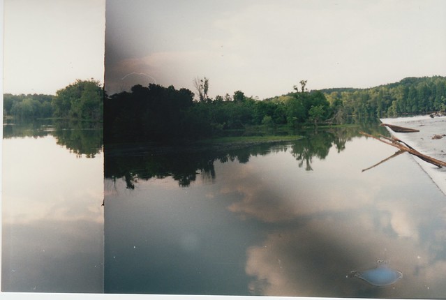
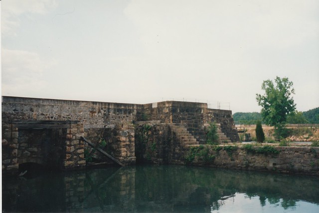
Here are a few old photos of Savannah Rapids Park on the Savannah River, in suburban Augusta, GA. This is the point where the river crosses the Fall Line, and the headgates for the historic Augusta Canal are here. These photos were taken around the headgates area, although it's a fairly large park and there's more to it than this. The website mentions something about a waterfall, although I don't recall ever seeing it. If I had, I'm fairly certain I would have taken a photo or two.

Augusta Locks

The main thing I do remember is looking around for alligators. I'd heard they showed up here now and then, and there were signs warning people to please leave the alligators alone, dammit. Ok, the signs didn't say "dammit", this being the South and all, but the point was conveyed. I didn't see any gators, though, and I was both relieved and disappointed. I'd seen alligators before, during a family vacation to Florida in the mid-80s. They were swimming around in a canal at Cape Canaveral, in fact. Somehow that didn't really count because it happened in Florida, though. Anyway, I finally saw a wild non-Floridian alligator at Hunting Island, on the South Carolina coast, and somehow managed not to get any photos of it. I told coworkers about it later and they weren't that impressed. I think the best analogy is with bears in the western US: Not something you see every day, and a real nuisance when they do show up.

Augusta Locks

Going back through these old photos, I'm struck by how few photos I have of the Augusta area, despite having lived there for several years. I'm not sure why not; the old historic downtown was quite photogenic, at least if you ignored all the empty storefronts. The Augusta Canal took a very scenic route from the headgates into downtown, past historic cotton mills and under historic bridges, before petering out in weeds and neglect in a bad part of town. I haven't been back in the last decade and maybe it's changed since then, but it wasn't exactly the most economically vibrant city, other than the one week every year when it became the center of the golf universe, and the locals all left town for the duration. Savannah and Charleston had it beat in the tourism department, it was too close to Atlanta to be much of a business hub on its own, and any business that didn't gravitate to Atlanta likely ended up in Columbia or Greenville-Spartanburg, SC instead. Locals seemed to regard this with a mix of puzzlement and resignation. Grand development schemes came and went without rousing the city from its economic doldrums -- a riverfront condo tower in a city that shunned condos and avoided downtown after dark; big new history and science museums the local government couldn't afford to actually operate or maintain; minor league baseball and even hockey(!) teams that came and went; even a riverfront "Georgia Golf Hall of Fame" full of cheesy (and often vandalized) statues of famous golfers. Nothing ever seemed to pan out, and nobody could figure out why. Augusta would make a lot more sense if there was some sort of centuries-old curse on the place, a curse where nothing really terrible ever happens, but the city's forever doomed to watch enviously as nearby cities get all the goodies and it doesn't. But, as usual, Savannah and Charleston ended up with all the cool ghost stories.