Showing posts with label south auditorium. Show all posts

Monday, September 02, 2024

Harrison Square Relief Panel

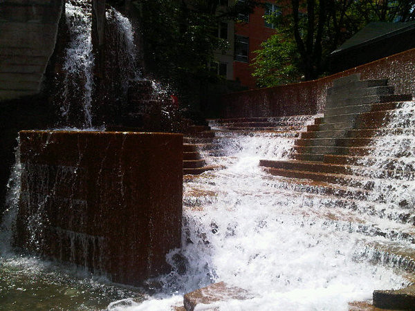
Some months ago I realized a new incarnation of the legendary[1] Spella Caffe had opened in my neighborhood, specifically in the lobby of the 1970s brutalist Harrison Square office complex. When I went to check it out I realized there was some groovy 1970s art in the lobby that I needed to take a few photos of, so I did, and fortunately it had a legible signature on it so could figure out the rest of the story from there.

This panel was created by Portland sculptor James Lee Hansen, whose work has appeared here a few times before, most recently in a July post about his Autumn Rider, located (a bit incongruously) at a shopping center in Gresham. As for our current subject, Hansen's website just calls it Harrison Square Relief Panel, and the only other info about it I could find on the interwebs comes to us from the July 8th, 1973 Oregonian, which ran a a photo of the freshly-unveiled art. The photo caption is brief but informative:

HANSEN SCULPTURE INSTALLED —- Becky Smith views new sculpture by James Hansen on main floor foyer wall of new First Harrison Square building. Commissioned by Jack J. Saltzman, the work is composed of nine sections, some in polished steel, some in steel given blue, yellow, and black automotive lacquer finishes. Hansen did bronze “Shaman” in front of State Highway Building on East Capitol Campus in Olympia in 1971.

So, working with automotive paint on steel is a cool idea. It occurs to me that it may have been easier to do this in 1973 than it is today; Hansen had the good fortune to be working at a time when cars came in lots of colors, which is not something new car buyers seem to want anymore in 2024. It seems like everyone wants to buy the largest, most threatening truck or SUV they can afford, and they only want them in the blandest colors available: black, white, grey, or beige. Like they're going for the Secret Service VIP motorcade look: Tough and official, and yet not drawing attention to your specific vehicle. I mean, I say that but I just bought a new car earlier this year (a fast little hatchback, not a chonky SUV), and the only available colors that I liked were blue and black, and I somewhat preferred the blue, but they had a black one on the lot while blue would have to be a special order that wouldn't be ready for months, so I got the black one. And the free market will undoubtedly chalk that up as yet another vote against cars coming in colors. ¯\_(ツ)_/¯

While looking for that one photo caption, I ran across a number of other vintage news articles about the then-new building that I thought were interesting. So it's time to bust out that Multnomah County library card again, and put on your best disco boots, because here we go...

  • 1971, the design for the building was unveiled with great fanfare. One of the last developable blocks in the South Auditorium district
  • August 18th & 19th articles on the groundbreaking for the new complex. The second story includes a photo of Mayor Terry Schrunk and Mayor-elect Neil... er, the guy we don't talk about.
  • A 1972 photo of the complex under construction, along with a few other cutting-edge modern buildings like the Lincoln Tower condos, a few blocks further south on 1st
  • July 1972 photo from the topping-out of the building, featuring pine trees in planters being emplaced by crane. Content warning: The photo also features that one creepy mayor whose name has fortunately been lost to history.
  • In other 1972 announcements, the new building would soon be home to a swanky new fine dining restaurant. Which led me to several other stories about the Portland fine dining scene in the 1970s. Which was just as groovy as you'd expect, but just a bit off topic for this post, so I moved all that stuff down to footnote 2.
  • The building won a Portland AIA award in June 1973
  • October 1974 profile of the main developer behind the complex. The article helpfully explains that "entrepreneur" is a fancy new synonym for "hustler", a word people used to mean as a compliment back in the good old days.
  • June 1975: One of the anchor tenants was the local office of Xerox Corp., and they were currently showcasing the shiny new Xerox 9200, a large, cutting-edge photocopying system. These would have been built at the Xerox campus in Silicon Valley, while somewhere in the same complex the company's research division was hard at work on the Xerox Alto, the first computer system with a modern GUI. Which was a revolutionary idea, but one that Xerox made approximately zero dollars from, even as Steve Jobs & Co. wandered around the lab making detailed notes on everything they saw.
  • In 1976, the building took part in a previous episode of mural mania here; they went by "supergraphics" at the time. This was seen as a cheap way to liven up the city's recent crop of modern buildings. Which feels like a bit of an indictment of 1970s architecture -- it's only 3 years old and already needs livening up?
  • An article about some other art installed around the same time as the Relief Panel, & designed by a local artist, brutalist concrete planters outside the main entrance to the building. I don't think they're there anymore, though I also usually don't pay much attention to concrete planters, so I may have to check again next time I'm getting coffee.

Footnotes

1. Coffee

Yelp reviews for the previous location on SW 5th between Washington & Alder. 2012 Willamette Week article called them "universally beloved", but then they had gelato at the time, and I'm not sure the new location does. A 2016 article said they had the best coffee in the city (which is kind of a big deal), and imagined it as a sort of caffeinated wormhole connected directly to Rome or Milan. A 2009 Oregonian piece -- when they were still a humble food cart -- also crowned them the best coffee place in town, serving the best gelato in town.

An April 2023 Portland Monthly article on best local coffee places mentions a place out in the Rose City Park neighborhood that uses Spella beans, as a place you can get the coffee without making the trek to the downtown-ish mothership. At some point in the last decade the local media ecosystem collectively decided their readers live on the eastside, and things downtown are now a trek instead of having a convenient central location. Possibly right around the time living close in on the westside (or at least in a trendy or trend-adjacent corner of the westside, i.e. the Pearl, South Waterfront, or NW Portland) became unaffordable on a print media paycheck. This is an unusual development, possibly the first time it's been this way.

2. 70s Restaurants

  • December 1972 Journal article on the planned Georges III, an upcoming swanky restaurant planned for Harrison Square, by one of the co-owners of The Captain's Corner, the big movers-and-shakers restaurant of the day. He mentioned that startup costs were expected to run around $200k in 1973 dollars, or around $1.4M today.
  • 1973 piece insisting South Auditorium was on the verge of becoming a trendy neighborhood. The new Harrison Square complex was going to get a new fancy restaurant, joining a surprisingly long (as in, nonzero) list of neighborhood restaurants.
  • To give you some idea of what a swanky restaurant was like in those days, here's an article from a few months later about The Captain's Corner, where the marquee menu item was the steak & lobster combo ($8.75, or $60.66 in 2023 dollars), which I gather was a bit of premium over the many other surf-n-turf joints around town. Other menu items included chicken livers with wine & mushroom sauce ($4.25 then, $29.26 now), bacon-wrapped scallops in white wine sauce ($4.75 / $32.93) and shrimp curry Bombay ($4.95 / $34.31). The Georges III article above notes that Captain's Corner still employed three of the original Captain's Corner Girls. It doesn't elaborate on what was involved in being a Captain's Corner Girl, but just going by the year it probably had something to do with cocktails or cigars, plus cleavage.
  • 1974 review of Georges III. We're told the restaurant was superb, with an affordable and relatively adventurous menu by early 70s standards, including such exotic dishes as "prawns Genoa" and "baked oysters Ralston", whatever those are, or were. You could even order l'escargots if you were up for a walk on the wild side (the reviewer wasn't), and the old standbys like cream of mushroom soup were prepared fresh in house, and the whole bill came to $25.25 for cocktails, wine, dinner, and dessert for three people. At one point the reviewer marvels at the the location:
    Where this once was a rundown, ugly area, there is this sparkling park-like situation, handsome buildings, Portland's most concentrated area of fine apartments, and just generally a sense of well-being.
  • A positive review of Georges Three from October 1977 (they had dropped the roman numerals in favor of "Three" a couple of years earlier; maybe they figured a name too much like "George III" was a bad look with the Bicentennial coming up). But within two years it was gone, replaced by a ribs place called "Fast Eddie's", which seems to have stuck around until around 1983, and as far as I know that was the last food or beverage business in the building until Spella arrived in early 2023 or late 2022. Meanwhile, Captain's Corner got a largely negative review in October 1978 and was still open a decade layer. Though at this point it's been gone for decades too.
  • One last item and we're done with this restaurant rabbit hole. As of October 1970, the Oregonian still had a section of the paper called "Women's News", as it had been for decades, but on October 12th the headline story concerned an upcoming womens' equality conference. One of the accompanying photos shows a Captain's Corner waitress chatting with a local rep from the local AFL-CIO Waitresses' Union. Another story on the same page relays some remarks by a (female) judge in the state family court system cautioning readers that getting divorced is not all just fun and games; it's expensive, time consuming, and blended families are weird and complicated, and won't someone please think of the children, basically.

Saturday, August 16, 2014

Lovejoy Park Shelter

I've done quite a few posts about Lovejoy Fountain over the years this blog's been going. It's in my neighborhood, and I'm kind of fond of it. Besides the fountain itself, the park's also home to a large wooden shelter structure, on the west end of the park, "upstream" of the fountain. The shelter was part of the original park design, and it was designed by a duo of prominent architects, Charles Moore & William Turnbull. So I figured it merited a post of its own.

A Metropolis Magazine article about Moore, "Why Charles Moore (Still) Matters", mentions the shelter project briefly:

“Who threw this tantrum?” That was the reaction—according to Halprin—of a number of Moore’s Yale architectural colleagues when they saw his Lovejoy Fountain Shelter (1966), perched atop the concrete waterfall designed by Moore, Halprin and Turnbull. The whole Portland Open Space Sequence, of which Lovejoy is a part, recalls the natural forms of the nearby High Sierra, with sprays, erosion channels, tumbled rocks, and weirs. Made of a series of board-formed concrete slabs, the fountain works as well with water as without. The pavilion serves as both mountaintop and protection, its expressive hillocks made with a latticework of straight wooden members. One explores the fountain like a natural discovery, climbing down, scaling up, losing one’s sense of oneself in the city. Moore had been interested in water as an element of architecture since his student days; that was, in fact, the topic of his doctoral dissertation at Princeton. In period photographs, one can see the fountain and the shelter against the geometric, repetitive backdrop of nearby SOM towers. “Looking at the photograph of that form, now 50 years old, I thought: This is what people are doing with the computer now,” Lyndon says. “How amazing is the juxtaposition again with the corporate modernism in the background. The latter was the norm of the time.” Before Frank Gehry (with whom Moore and his partners competed for the Beverly Hills Civic Center) lofted an angled chain-link fence in the air at his own famous house, Moore was working with the everyday to make something more monumental, memorable, and strange.

I'd just like to point out here, for the sake of geographical accuracy, that the Sierra Nevada mountains are nowhere near Portland as the article claims. It's true the Halprin designs were inspired by the Sierras, though. If they were being built today, the architects would have the decency to fudge and say they were inspired by the Cascade mountains, which are nearby. But no matter. The "who threw this tantrum?" reaction didn't entirely die down after 1966. A local architecture critic, writing about the Keller and Lovejoy fountains, recently referred to the shelter as "startlingly ugly". I'm not sure I agree; it seems like the fountain, and the park as a whole would look strangely unbalanced without the structure there.

I imagine the city would secretly love to remove the shelter, because homeless people often sleep under it to avoid the rain, which of course is the worst thing imaginable. But they can't tear it out, because it's part of the park design, and so is on the National Register of Historic Places as of 2013. So instead they're obligated to preserve and maintain it, which presents another problem. The shelter is a striking design but not necessarily built to last for decades in this climate. It slowly decayed for years, and its crazy-angled roof began to sag, and it became a case study in an article titled "When a Master Work Fails" (i.e. physically, not aesthetically)). Money arrived with the city's renewed interest in this part of town, and it finally underwent a major renovation that completed in spring 2014.

Sunday, March 30, 2014

Sheridan Triangle expedition


View Larger Map

Today's adventure takes us to the intersection at SW Naito & Sheridan, probably one of the uglier places I've ever covered here. At this intersection there's an oddly large, roughly porkchop-shaped traffic island. The city typically landscapes traffic islands this size and makes them sort of park-like (for example, Beryl Triangle, 5th & Caruthers, Regents & Alameda, etc.) This spot, though, is just a vast expanse of drab grey concrete, with a few weeds growing up through the cracks. On top of everything else it's just steps away from the noisy canyon of Interstate 405. It's a great candidate for the godawful ugliest, most brutal-looking, least urban-planned-Portlandia-looking space in the city, or at least within casual walking distance. Which is an actual award I just invented. We aren't here for the scenery, though, as ironic as that would be. And I'm not doing this to grab the top Google result for yet another thing nobody on Earth will ever search for, as rewarding as that always is. Instead we're here for an interesting bit of history that will become clear shortly.

Back in 2008, Portland's annual Pedalpalooza bike festival offered a "Worst of Portland" bike ride, and the ride started right here at Naito & Sheridan. The Portland Mercury described it as "Usually Portlanders can't stop jabbering about how awesome their city is for cyclists. This ride, however, showcases the worst and most dangerous routes. Just watch out for broken glass and 18-wheelers." At least one person survived this adventure, and posted an extensive Flickr photoset of the ride. It looks as though from here they headed across the Ross Island Bridge, then down the ramp onto McLoughlin. Then continued on McLoughlin to Holgate, out to the big railyard, over the Lafayette St. footbridge, and back under the railroad tracks on the ooky pedestrian underpass along Powell, and across the tracks again on the Brooklyn St. footbridge. Then back to McLoughlin and the (now replaced) tumbledown old viaduct near OMSI, and then up to a scramble around the Steel Bridge. That was either where the ride ended, or where the photographer stopped taking photos.

A common thread along that strange journey is that they generally followed busy streets designed in the 1920s thru 1940s, when the world was still learning how to design major roads properly. That era's vision of the high-speed traffic artery of the future did not really include bikes or pedestrians or any other ideas beyond getting from point A to point B as quickly as possible.

So how does this relate to the Naito & Sheridan traffic island? If you look at the overhead shot on the map above, you might notice the grey concrete comes in a few different shades, and you can sort of make out where the traffic flow used to be quite different than it is now. Look for the weedy seam up the middle of the triangle, not quite parallel with Naito. It turns out this was once the southern end of the old Harbor Drive freeway, aka Highway 99W, the 1940s highway that Portland tore out in 1973 to build Waterfront Park (which we're still bragging about, forty years later). At the intersection with Sheridan St, northbound Harbor Drive split off from Naito (then called Front Avenue) and angled downhill to where Riverplace is now, and continued through what's now Waterfront Park up to the Steel Bridge. So this ugly traffic island here is one of the last surviving relics of that long-vanished freeway.

Southbound Harbor Drive traffic actually passed under Front Avenue in a tunnel before merging onto Front at Sheridan. The aforementioned seam marks the edge of where this ramp used to be. For a better idea of what that was like, see this Vintage Portland post with a 1944 photo taken at this very spot, looking north toward the Harbor Drive interchange.

It turns out that the long-abandoned Grant Street Tunnel still exists; it was walled up after Harbor Drive was demolished, but was opened temporarily in 2011-2012 while the Water Bureau ran a new water main through it. If only I'd had the proper connections and known the right strings to pull, I would've loved to put on a hard hat and check it out, take a few photos, write a blog post about it, you know the drill.

The name "Sheridan Triangle" is something I invented just now, by the way I don't usually do that, but I figured it needed a name, and it didn't have one, and this was the obvious candidate. It turns out there are already Sheridan Triangles in Manhattan, Chicago, and Madison, WI, so one might argue that having a place by this name is the mark of a Real City. So, ok, that's kind of a silly argument. In any case, I occasionally think it would be fun to do something with the Sheridan Triangle to brighten it up a little. Maybe paint it, similar to the City Repair street graphics around town. That would be the cheapest option, anyway. A statue or a fountain or something might work here, too, but I'm not sure what it would take to de-uglify the area, short of completely tearing out this stretch of Naito and redoing it, building a cap over I-405, and probably replacing a lot of the buildings nearby. That would be a good start, albeit a very expensive good start.

Anyway, here are a few items from the Oregonian database related to this forgotten and misbegotten spot:

Saturday, December 21, 2013

Trio

Here are a few photos of Trio the brand new public art at the yet-to-open Lincoln St. MAX station, at the south end of downtown Portland. A recent TriMet press release describes it:

Seattle-area artist Elizabeth Conner and crew installed three abstract, mixed metal sculptures, entitled Trio. The steel sculptures were inspired by the theatrical and participatory work of choreographer Anna Halprin and Lawrence Halprin, the architect of the adjacent Halprin District. The sculptures range in height from 9 to 12 feet and 2 to 5 feet in width.

“In designing sculptures for this space, I considered the Halprins’ radical advocacy for a wide range of participation in spaces that are truly public,” said Conner. “My artwork for this space is a respectful reference to the ephemeral nature of traveling from one place to another, with a glimpse of movement, light and shadow, out of the corner of the eye.”

TriMet usually looks for art that's somehow inspired by the surrounding neighborhood. I rather like this idea that 1960s modernism is my neighborhood's local vernacular.

Trio Trio Trio

Thursday, January 27, 2011

january fog

january fog

As seen yesterday near Lovejoy Fountain Plaza.

You've undoubtedly seen shots just like this in any number of movies, except here we've got students & office workers instead of ringwraiths or headless horsemen or vampires or Jack the Ripper or whatever. So, not so much in the freaky supernatural drama department here. On the bright side, these photos are costing you absolutely nothing to look at, so compared to the cost of a movie ticket, mega-sized popcorn, 128 oz. Coke, dubious-looking "hot dog", and a tub of Raisinets, it's really quite a good deal.

january fog

january fog

january fog

Sunday, January 16, 2011

Chimney Fountain

This post probably counts as overkill. I've got a Flickr slideshow, an embedded Google map, and a Twitvid clip in this post, just to tell you about a small fountain in an obscure spot on the edge of downtown Portland. The Chimney Fountain is, as the name suggests, shaped more or less like an old brick chimney, with water bubbling up from the center and spilling down its sides. It's located next to SW Lincoln St., along the pedestrian-only 2nd Avenue walkway, in the 60's-era South Auditorium urban renewal district.


View Larger Map

It doesn't look particularly special or important if you don't know the backstory behind it. The chimney shape supposedly symbolizes the area before the urban renewal bulldozers arrived, a working class neighborhood of Jewish and Italian immigrants, with small houses, family businesses (including the deli with reputedly the best bagels in town), several synagogues, etc. For more about the old neighborhood, there's a Portland Jewish Review story and a Daily Kos essay you might be interested in. I wish I had a more concrete reference for the fountain-as-historical-marker part. I know I've read that before, but I haven't found a link to share yet. I'll update the post if I can document that, but until then don't cite this notion as a fact in your term paper, or wager large sums of money on it or anything.

The fountain does double symbolic duty, in fact, since it also serves as the "Source Fountain" in the Halprin plan for the area. The idea is that water bubbles up at a little spring here. Then, flowing north, it becomes a rushing mountain stream at Lovejoy Fountain, and finally a majestic waterfall at Keller Fountain. Symbolically, I mean. The water actually recirculates separately at each fountain, but no matter.

The fountain occasionally does triple duty, as a sort of jetted bathtub for the homeless. I'm sure that wasn't a design goal behind the fountain, but it appears to do the job. I didn't actually go and ask for a user review, I mean, if I was taking a bath and minding my own business, and a stranger came up and wanted to interview me, I'd take it rather badly. Wouldn't you?

Wednesday, September 29, 2010

penstemon, lovejoy fountain

penstemon, lovejoy fountain

Fair-to-middling macro pics of penstemon flowers near Lovejoy Fountain. Before you rush to compliment me on my newfound botanical ID skillz, I should explain that I only know this because a commenter explained it to me on a previous post here. And now every time I post any penstemon flowers I need to go back and refer to the comment thing -- I've already done it once before here.

I realize me ragging on my own photos here gets kind of tiresome, and really they aren't so bad for handheld tripodless macro pics taken in rather low light on a windy day. I just don't think National Geographic would return my calls if I sent them a portfolio that contained these, that's all I'm saying.

penstemon, lovejoy fountain

penstemon, lovejoy fountain

penstemon, lovejoy fountain

penstemon, lovejoy fountain

penstemon, lovejoy fountain

Monday, August 30, 2010

squirrel, august 2010

squirrel, august 2010

As seen near Lovejoy Fountain Plaza. I haven't taken many photos of squirrels lately, but this one was glaring at me as I walked past its tree. It didn't run away and squawk at me, it just sat there glaring. This clearly went against the natural order of things, so I figured I'd show it who's the boss by taking its picture and putting it up on the interwebs. Take that, squirrel. Neener, neener, neener.

squirrel, august 2010